How to See Wallet Connections on the Canton Network
Written by
Yuliia Borivets
,
Marketing Specialist
Published

As the Canton Network grows, participants are increasingly connected through complex webs of transfers, reward shares, fees, and app-level activity. Transfer data shows that value moved, but not how participants relate to one another, which wallets interact most frequently, or where clusters of activity form.
Network Graph, from Sync Insights, closes that gap by mapping relationships between wallets, providers, and applications. Static transfer lists become interactive network maps that reveal structure, behavior, and interaction patterns at a glance. Watch the video to see how it works.
The Missing Context Behind Transfers
Anyone trying to understand activity on the Canton Network hits the same wall: the transfers are there, but you cannot easily visualize the relationships behind them. Value moves between wallets, apps, and providers, but the "who interacts with whom" is buried in thousands of rows of data.
That makes basic questions hard to answer:
Which wallets are connected?
Which providers interact most often?
Where is activity clustering?
How are apps linked through rewards or fees?
The network functions as a connected system — but without a way to see that structure, it stays invisible.
A Visual Map of How Wallets Connects
Every wallet on Canton sits inside a larger interaction pattern. With Network Graph, that pattern becomes visible in seconds. Each wallet becomes a node. Every transfer becomes a directional connection. Structure appears in a way spreadsheets can't show.
Opening the graph surfaces:
Who's connected to whom
Which wallets matter most
How transfers form relational patterns
Where activity concentrates in the network
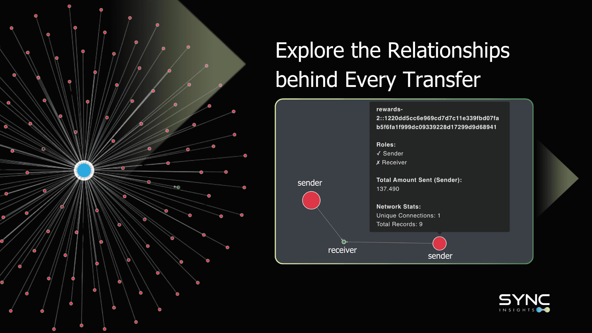
The relational structure of the network — previously buried in rows of data — becomes something you can see and act on.
How It Works
Network Graph draws on existing Canton Network transfer data — no additional setup or integration required. Each wallet, provider, or application is rendered as a node; each transfer between them becomes a directional edge. Nodes cluster automatically based on interaction frequency, so tightly connected participants group visually without any manual configuration.
From there, filtering by time range, participant type, or transaction category narrows the view to a specific question — a reward cycle, a provider's activity, or a single wallet's full interaction history. Zooming into any node reveals its direct connections; zooming out shows the shape of the network as a whole.
Why This Visibility Matters
Uncovers hidden patterns in transfer activity
Helps maintain network fairness
Improves trust among network participants
Provides data-backed evidence for governance or operational decisions
Enables fast root-cause analysis
Participants can answer questions in the moment instead of digging through rows of data:
"Why did rewards spike today?"
"Which wallets contributed to this sudden movement?"
"Where is this flow of funds actually coming from?"
Provides analytics no other tool in the Canton ecosystem offers
Visually intuitive, not table-bound
Built around real participant needs
Capable of revealing complex relationships at scale
Network Graph gives participants a clear, visual understanding of how wallets, providers, and applications connect across the ecosystem — strengthening transparency, supporting governance, and making the network easier to reason about, whether the task is analyzing reward flows, evaluating performance, or investigating an anomaly.
Explore the relationships behind your transfers
Pick a wallet, a provider, or a spike in activity — Network Graph shows you the relationships behind it in seconds, not hours of spreadsheet digging.